

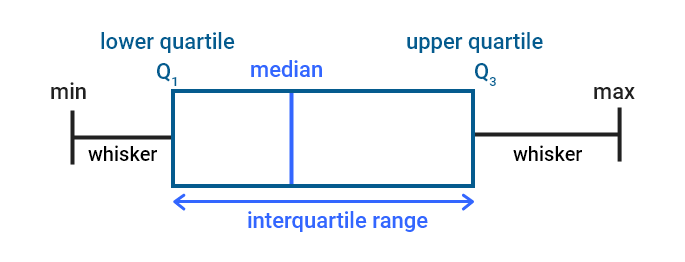
In Year 8 Maths, understanding how to summarize and interpret data is crucial, and two key tools that help with this are the five-number summary and box plots. The five-number summary includes five important values: the minimum (the smallest number in the data set), the first quartile (Q1) (which represents the middle value of the lower half of the data), the median (Q2) (the middle value of the entire data set), the third quartile (Q3) (the middle value of the upper half of the data), and the maximum (the largest value). These values give a quick overview of the data, helping us see how it is spread out and where most of the values are concentrated. A box plot is a graphical representation of the five-number summary. It consists of a box that stretches from Q1 to Q3, which shows the interquartile range (IQR), or the middle 50% of the data. Inside the box is a line that represents the median. The whiskers extend from the box to show the minimum and maximum values. If there are any outliers—values that are much smaller or larger than the rest of the data—they are marked separately, often with dots. Box plots and the five-number summary make it easier to visualize data and understand its spread, central tendency, and any unusual data points. They are especially useful when comparing multiple data sets, as they give a clear picture of the range, median, and overall distribution. By learning how to use these tools, students can analyze data more effectively and confidently, helping them not only in maths but in real-life situations where interpreting data is important.
David Hanna